Chart & Graph Report
The Charts & Graphs report enables users to visualize complex data through diverse visualizations such as bar charts, pie charts, and bubble charts. It offers flexibility by allowing users to switch chart types seamlessly without needing to recreate them. Additionally, users can apply aggregate functions to customize data calculation and summarization according to their preferences.
Creating A Chart & Graph Report
Follow these steps to create a Chart & Graph report:
- Click on the "Continue" button to create a Chart & Graph Report.
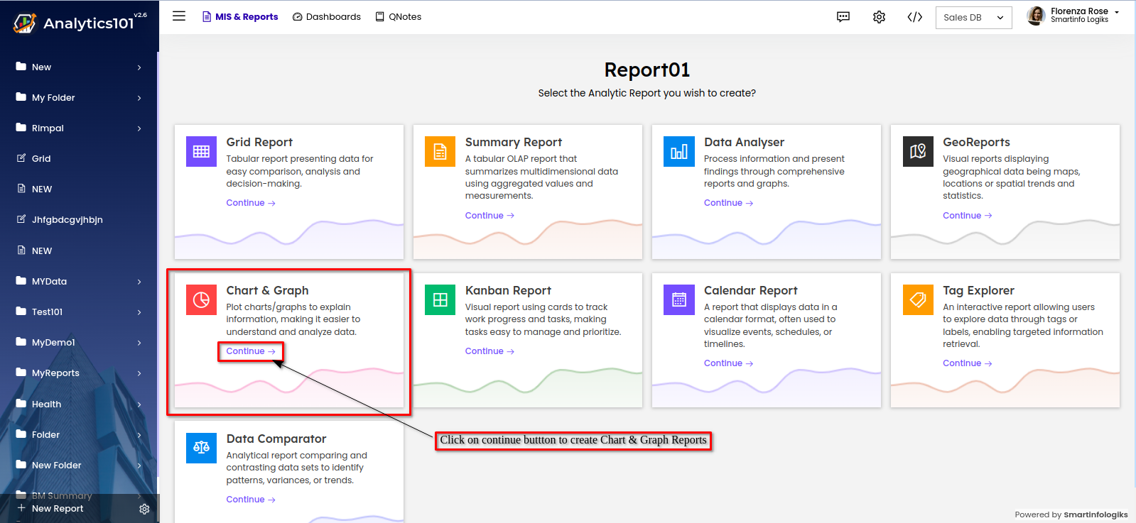
- The Chart & Graph Report editor window opens up:
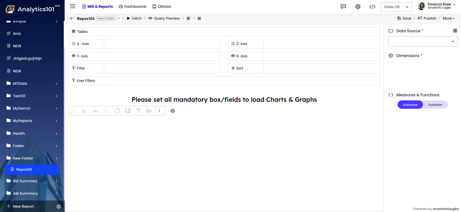
- Select the table form "Data Source" drop down.

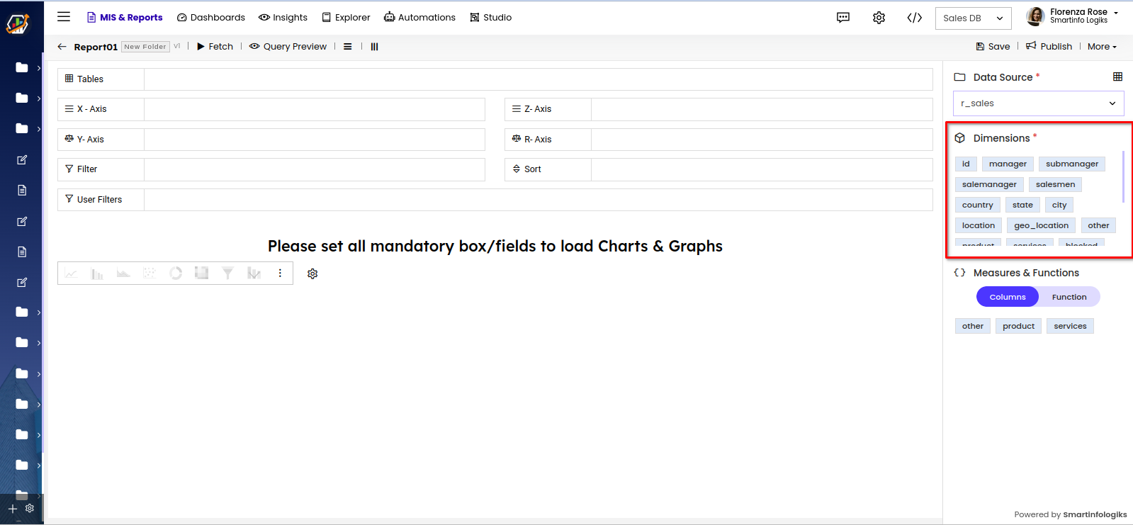
- Columns will appear in the "Dimensions" section as shown below :
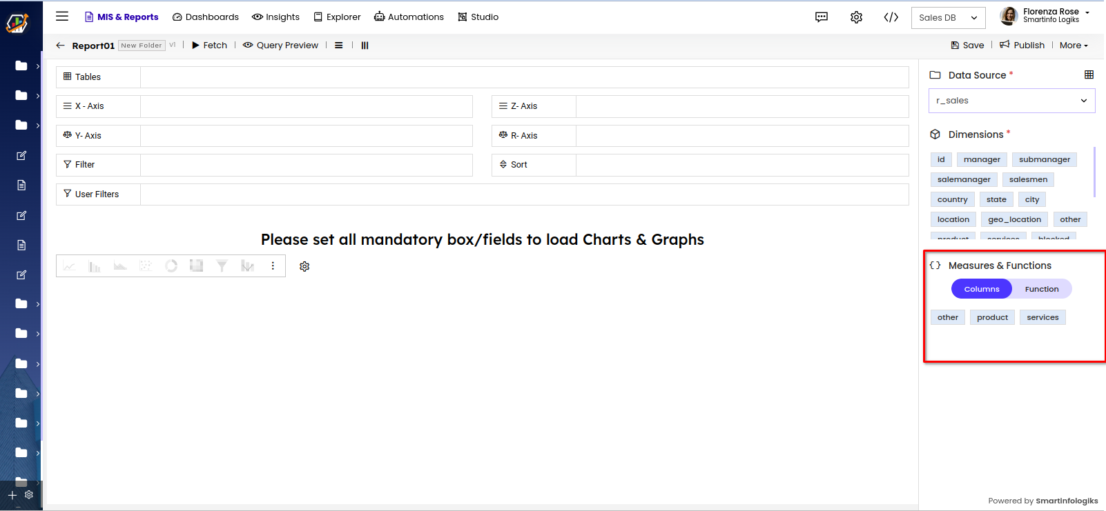
- Functions section under dimensions section contains all the formulas both existing ones in the system as well as user customised formula, enabling users to tailor reports according to their preferences.
- Drag and drop the columns onto their respective shelves.
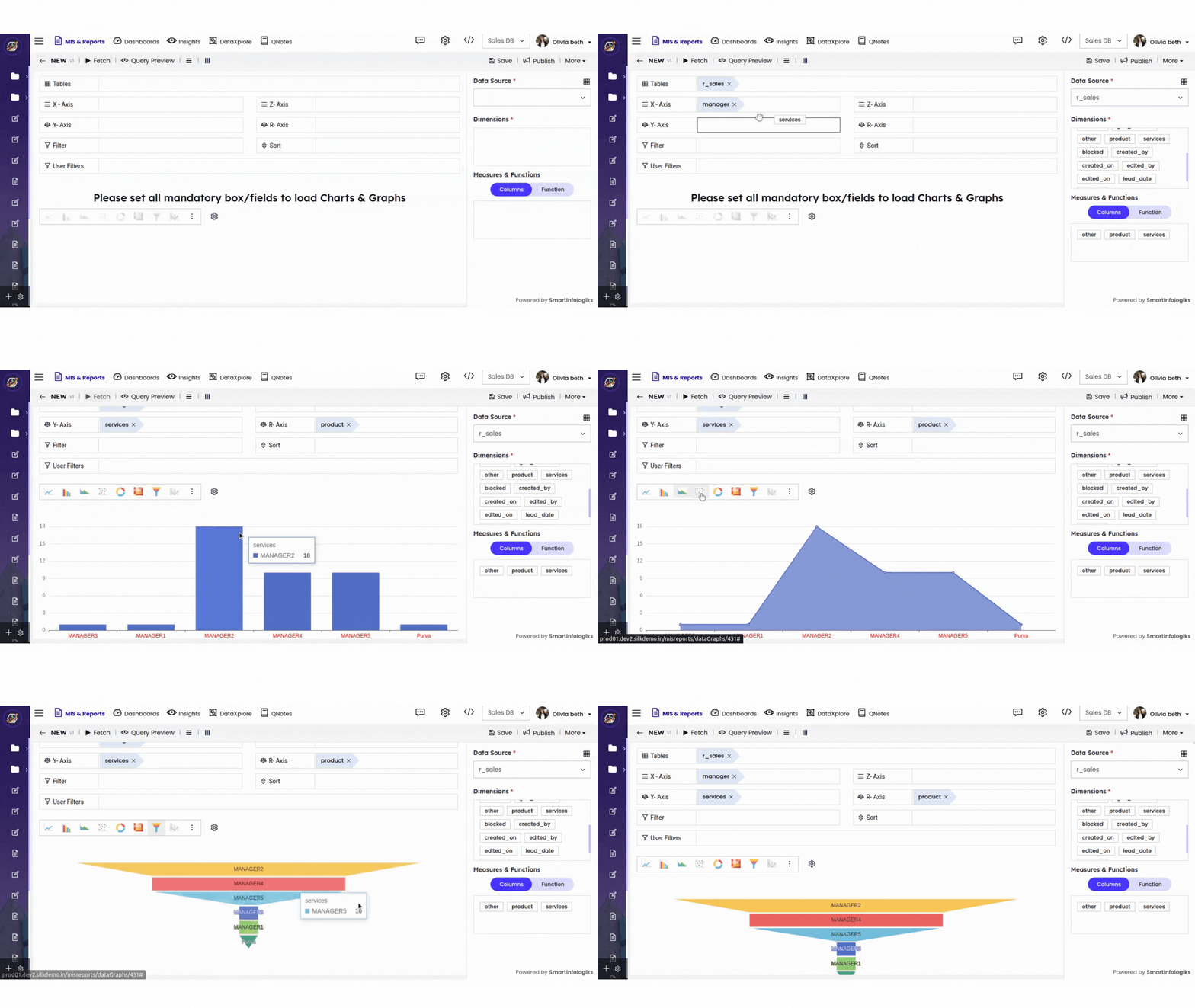
- Click the Fetch button to Generate Chart & Graph Report, the generated report will appear on the screen.
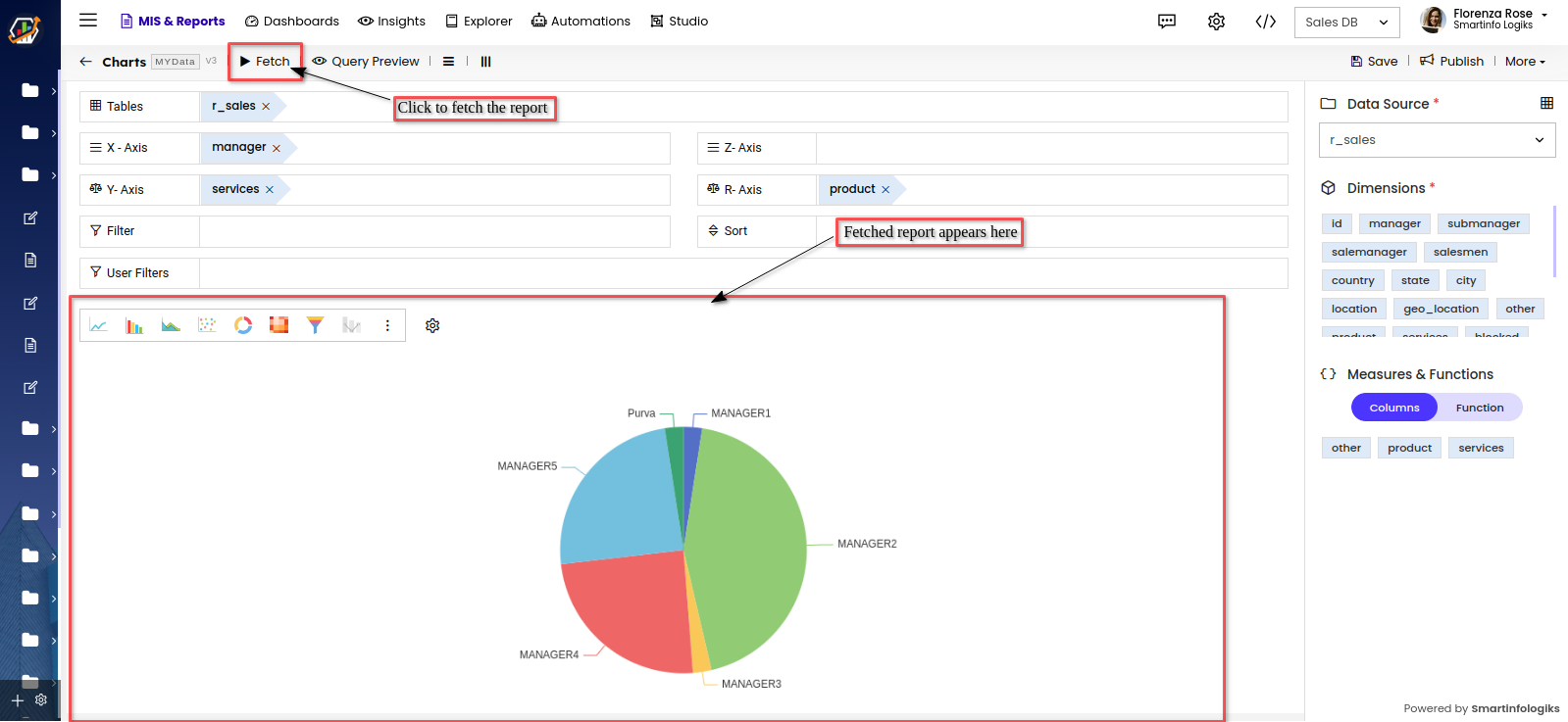
- Click the "Save" button to save the Chart & Graph report.
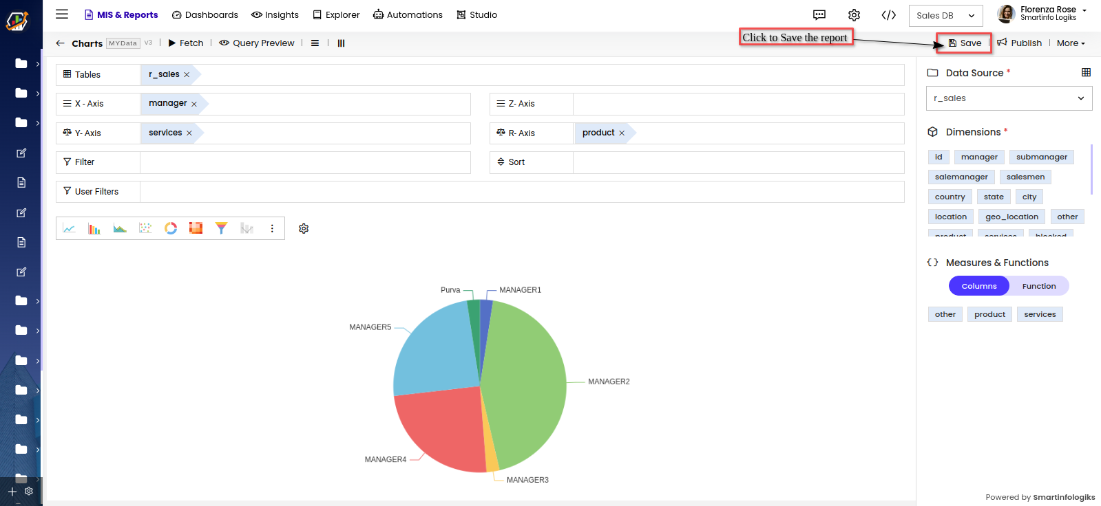
- Click the "Publish" button to publish the Chart & Graph report.
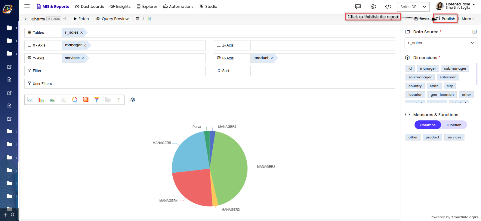
- After publishing the Chart & Graph Report, it will be visible on the screen shown below:
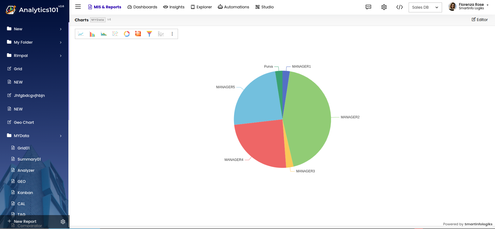
- Viewers can modify the graph type from the graph menu on the published report, which displays the possible charts
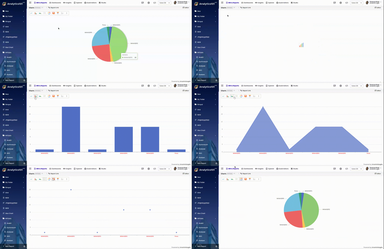
Chart Design
Users can switch the chart type from the box that offers various chart options.
The gear icon next to this menu serves as the legend manager, allowing the report creator to customize legend names and adjust their position as needed.
- Given below is a brief description of the shelves in the Chart & Graph tab.
X-Axis: Column dropped in this shelf appears horizontally across X-axis.
Y-Axis: Column dropped in this shelf appears vertically across Y-axis. You can drop multiple columns in this shelf to create charts with multiple Y-axis.
Z-Axis: The Z-axis in the dataset is employed to represent the third dimension, typically visualised with a spectrum of colors.
R-Axis: The R-axis denotes numeric values, visually conveying size-related information. It is most prominently used in bubble chart.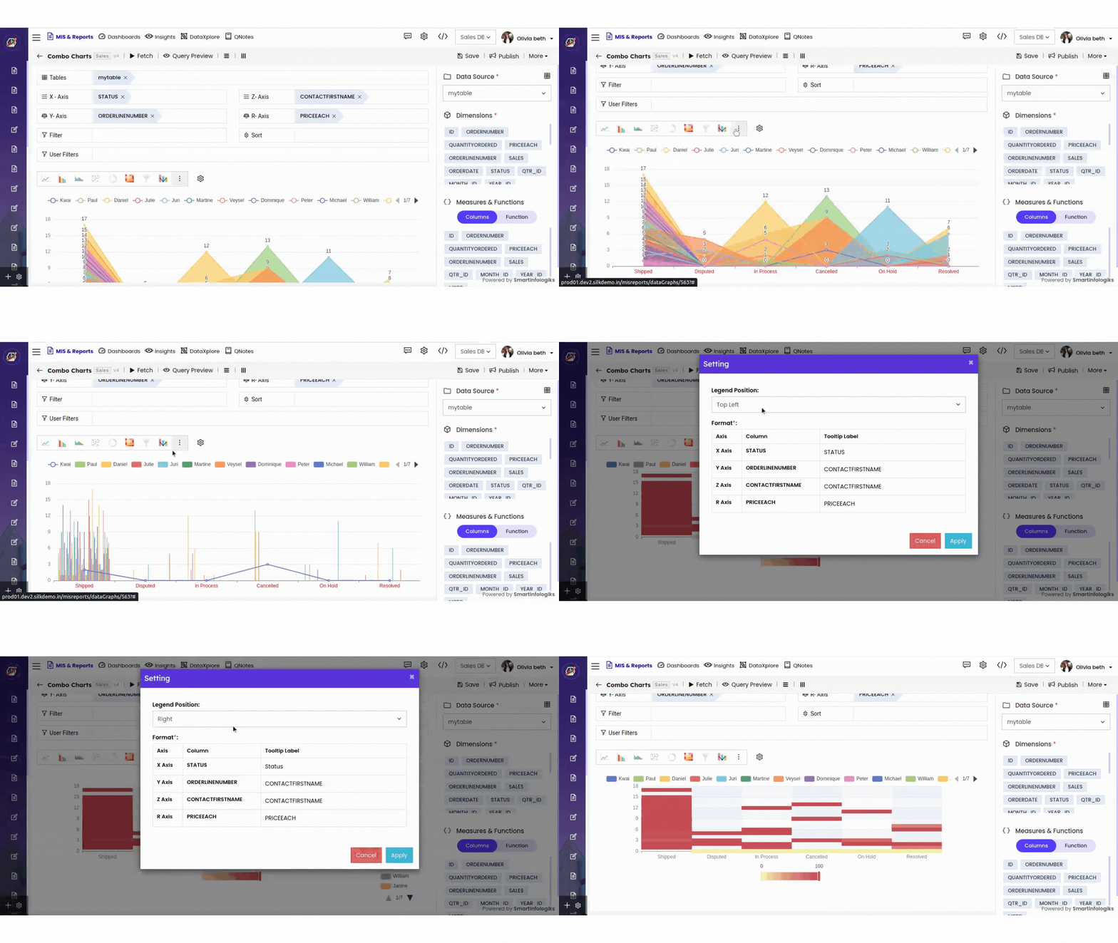
More in Chart & Graph Report Editor
To manage the report click on the More , different options for managing the report will be displayed.
Edit:
- Click the Edit to edit the report.
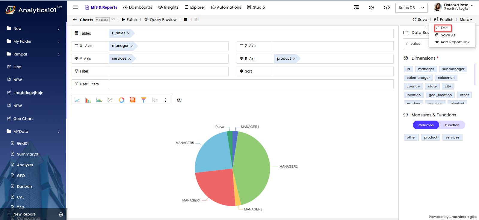
- A Pop up window for editing the report will appear.
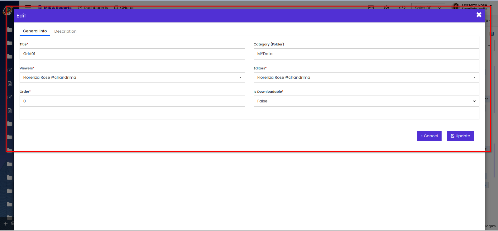
Title- User can edit the title of the Report.
Category- To edit the folder of the report.
Viewers- Gives viewing access to the users selected.
Editors- Gives editing access to the selected users.
Order- User can assign the position of a report like 1st, 5th, etc.
Is Downloadable- enables users to download the published report.
- Click the Edit to edit the report.
Save As:
- Click the 'Save As' to clone the report.

- A Confirmation window will be displayed.
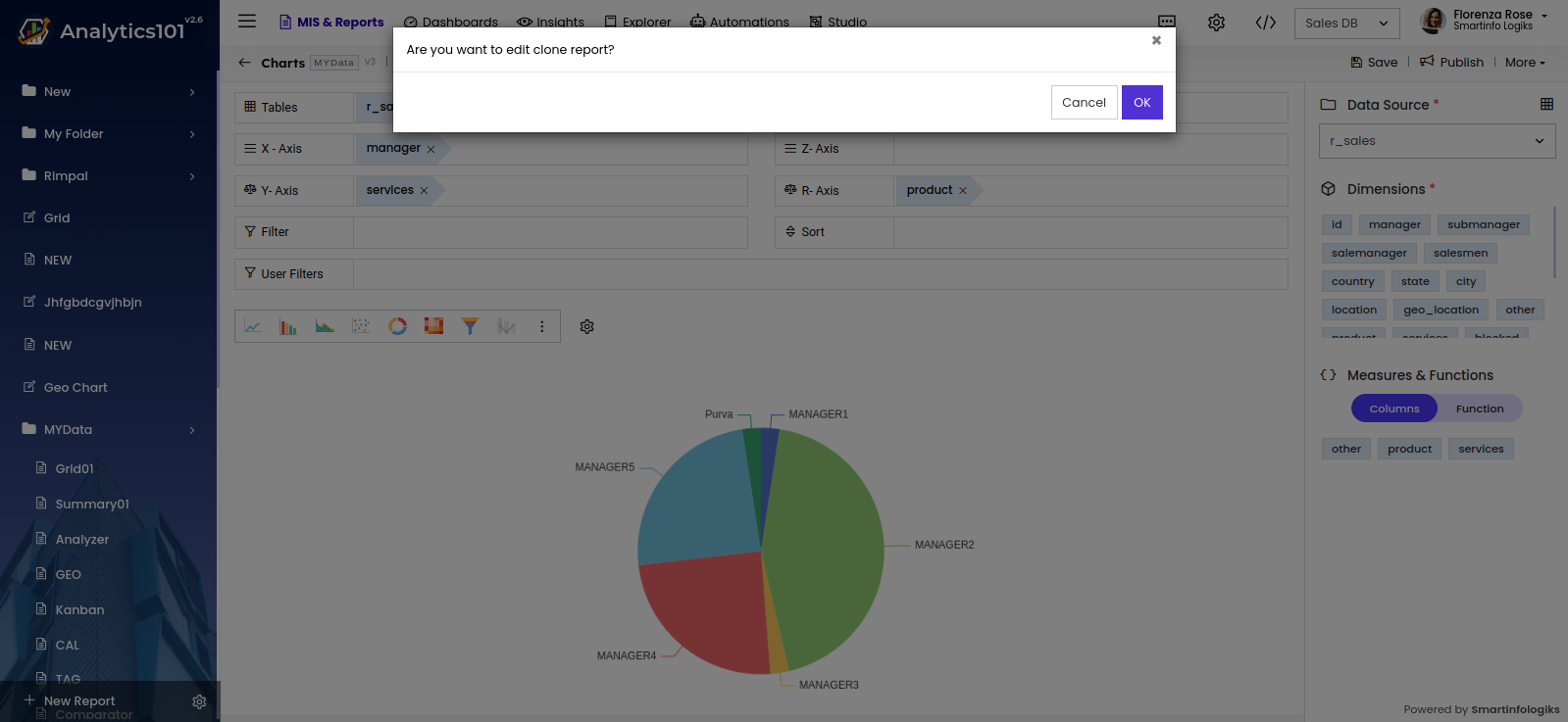
- On clicking the 'OK' button, the report will be cloned.
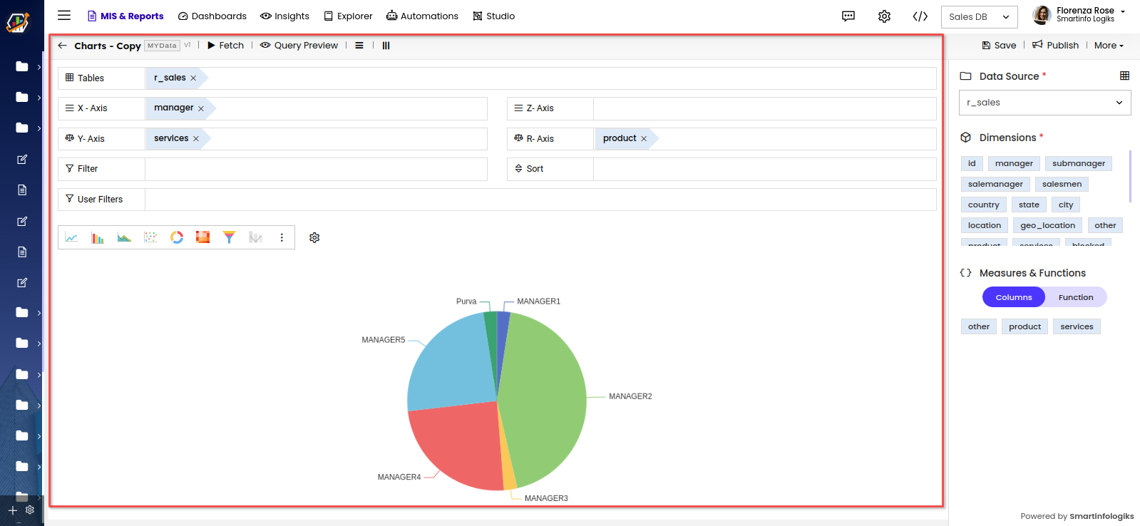
- Click the 'Save As' to clone the report.
Add Report Link
- Click the "Add Report Link" located under the More to link another report to this Chart & Graph report.Click the Add Report Link option from the More section.
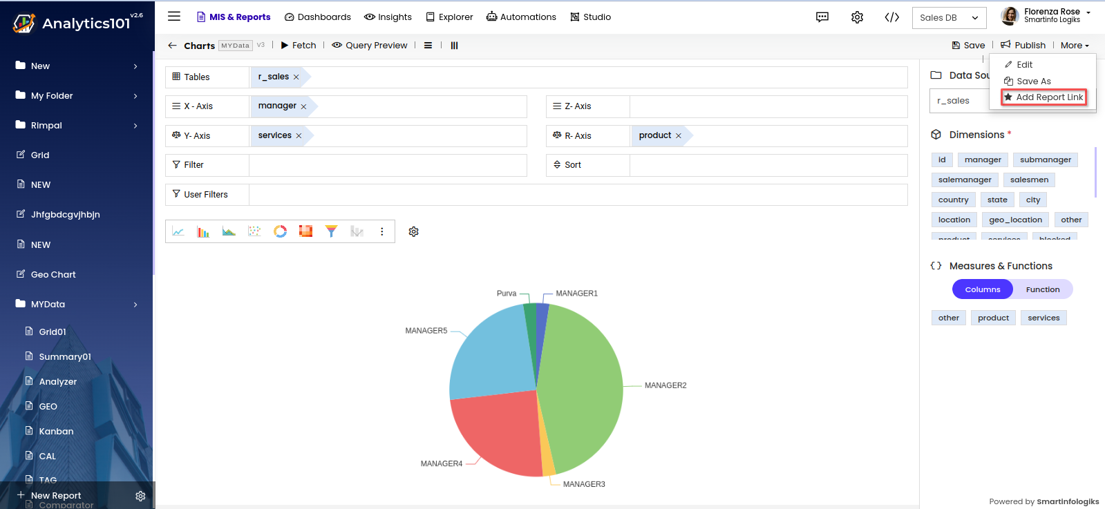
- The add link form opens shown below after clicking the Add Report link.
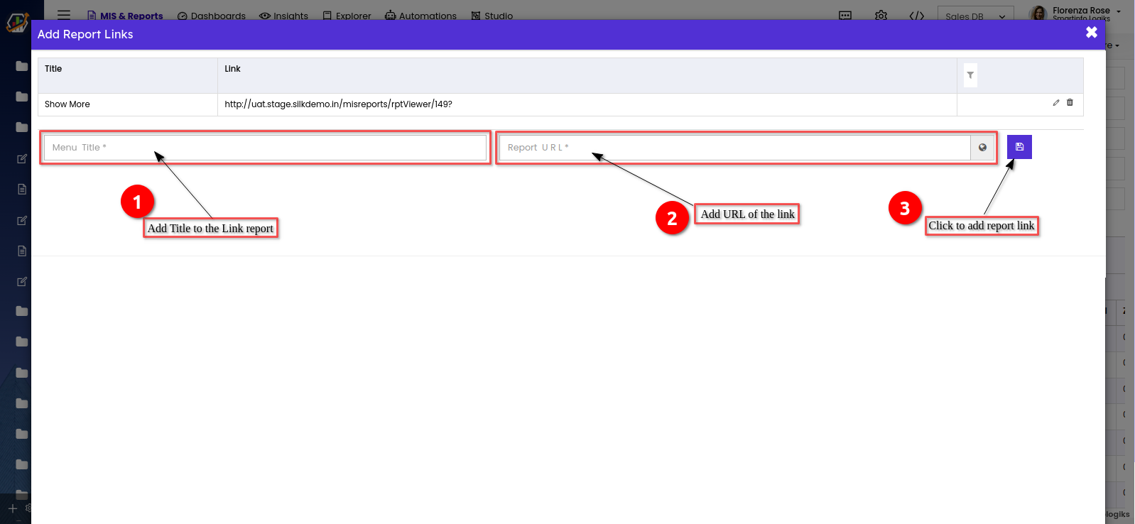
Title - Enter the Title you would want to view on the report link.
Link - Enter the URL of the report you wish to link to or show with another report - As shown below, when the report is linked, it appears in a specific link added report.
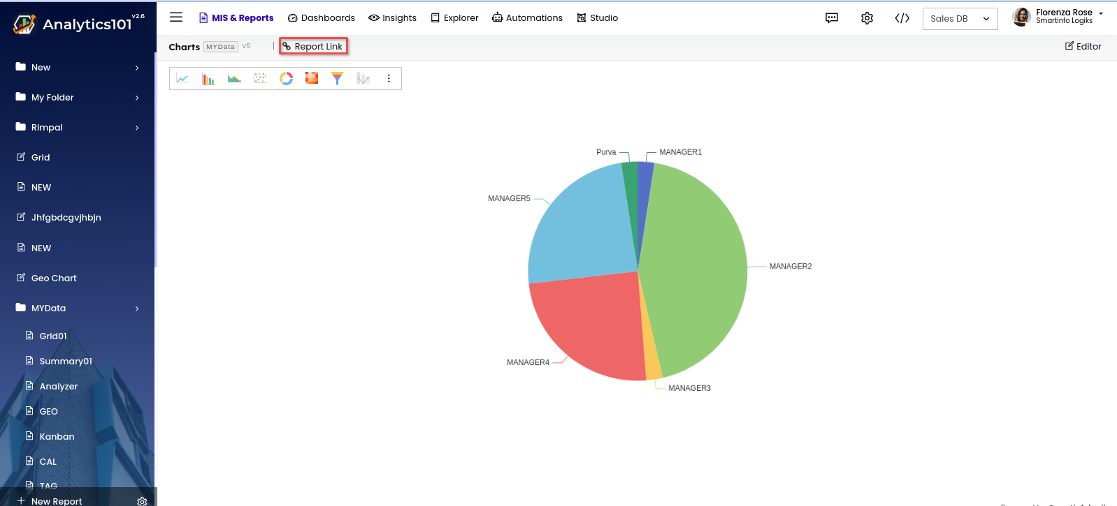
- Click the "Add Report Link" located under the More to link another report to this Chart & Graph report.Click the Add Report Link option from the More section.
