Basic Concepts of Analytics101
- Analytics101 is a self-service BI and data analytics software that lets you analyze your data, create stunning data visualizations, and discover hidden insights in minutes.
- Analytics101 is an Enterprise ready BI Platform which supports Analytics, Reporting, MIS, Dashboards, Insights, Query Notes and Cognitive Toolkits for varied data sources including but not limited to RDBMS, BigData and APIDB for Data Centric Modern Economy.
- Data is often presented visually using charts, graphs, and dashboards. Visualization makes complex data more understandable and allows stakeholders to grasp insights quickly.
The various concepts in Analytics101 :
1. MIS & Reports
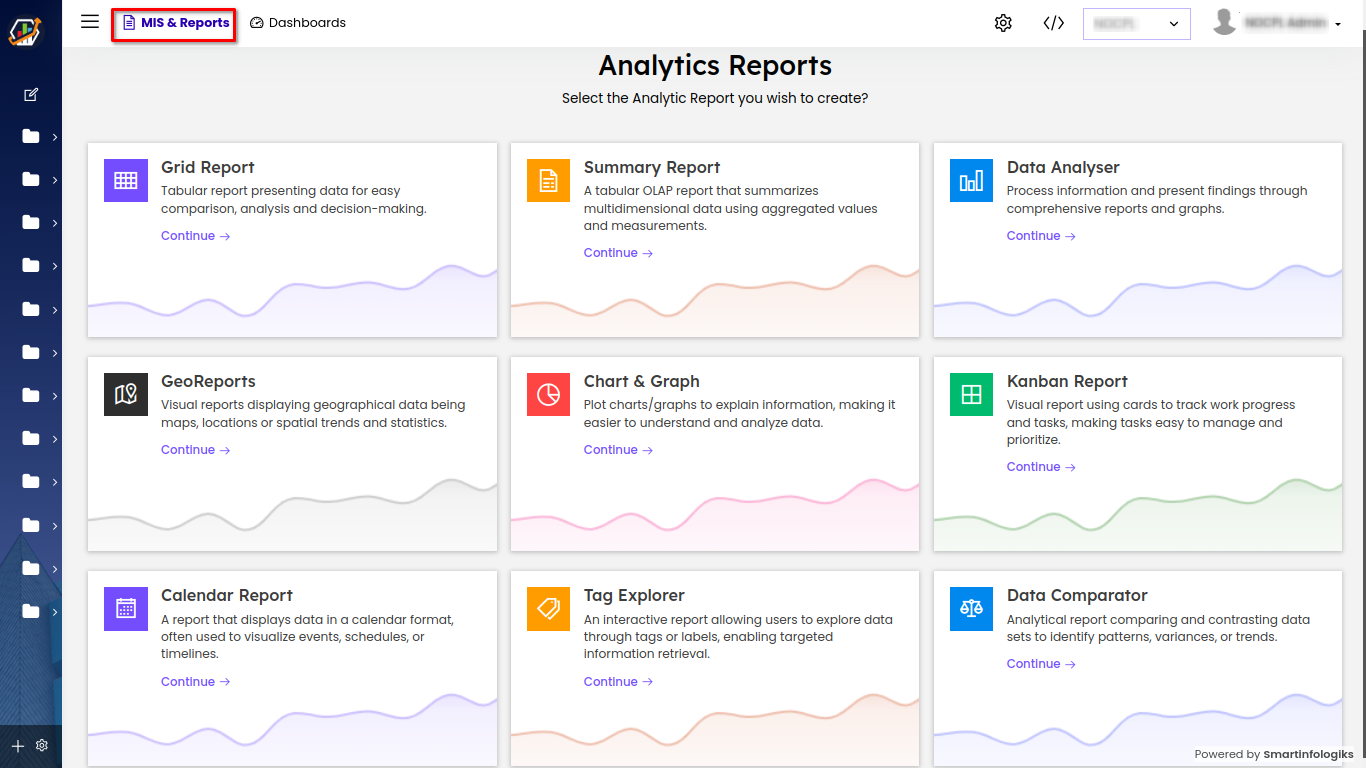
MIS (Management Information System) and Reports serve as the backbone of our analytics application, empowering users to generate a diverse range of individual reports. From concise summaries that provide at-a-glance insights to detailed grids for comprehensive data analysis, and visually appealing charts and graphs for trend visualization, MIS and Reports cater to a multitude of analytics purposes. These robust tools enable users to extract, structure, and present data in a way that best suits their needs, ensuring informed decision-making and data-driven strategies. With their flexibility and versatility, MIS and Reports are pivotal components for transforming raw data into actionable knowledge within our analytics ecosystem.

- Grid Report : Tabular report presenting data for easy comparison, analysis and decision-making, typically in rows and columns.
- Summary Report : Concise report presenting key data points in a tabular format, facilitating quick overview and analysis.
- Data Analyser : Process information and present findings through comprehensive reports and charts/graphs.
- Geo Reports : Visual reports displaying geographical data being maps, locations or spatial trends and statistics.
- Charts & Graph : Plot charts/graphs to explain information, making it easier to understand and analyze data.
- Kanban Report : Visual report using cards to track work progress and tasks, making tasks easy to manage and prioritize.
- Calendar Report : A report that displays data in a calendar format, often used to visualize events, schedules, or timelines.
- Tag Explorer : An interactive report allowing users to explore data through tags or labels, enabling targeted information retrieval.
- Data Comparator : Analytical report comparing and contrasting data sets to identify patterns, variances, or trends.
2. Dashboards
Dashboards typically include charts, graphs, and maps that visually represent data trends. Common types of visualizations include bar charts, line graphs, pie charts, heat maps, and scatter plots. These dashboards provide real-time insights into various aspects of an organization's operations, allowing users to monitor trends, track goals, and make data-driven decisions.
3. Explorer
The Explorer module serves as a valuable tool for running SQL queries on integrated databases. By following the steps outlined in this user manual, users can effectively execute queries, save them for future reference, and clone existing queries for further customization. With its support for various database drivers, Explorer empowers users to efficiently interact with and manipulate data to meet their specific requirements.
4. Insight
The Insight module within our analytics platform provides users with valuable and actionable insights derived from data analysis. With intuitive visualizations and comprehensive reports, users gain a deeper understanding of data trends and patterns, empowering informed decision-making for enhanced business outcomes.
5. Chatbox
The chatbox module in Analytics provides users with a convenient platform for real-time communication and support.
